
What your client gets
PanoFlow wraps your renders in a sales app the developer can put on a showroom screen or an Android tablet.
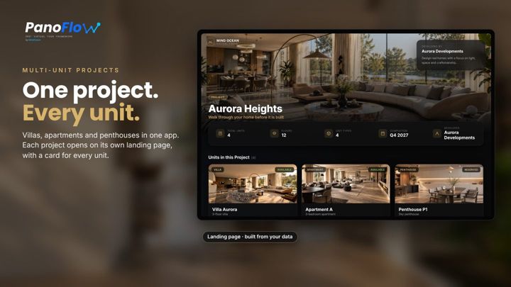
Project browser
Landing page with the project, developer panel and a card for every unit.
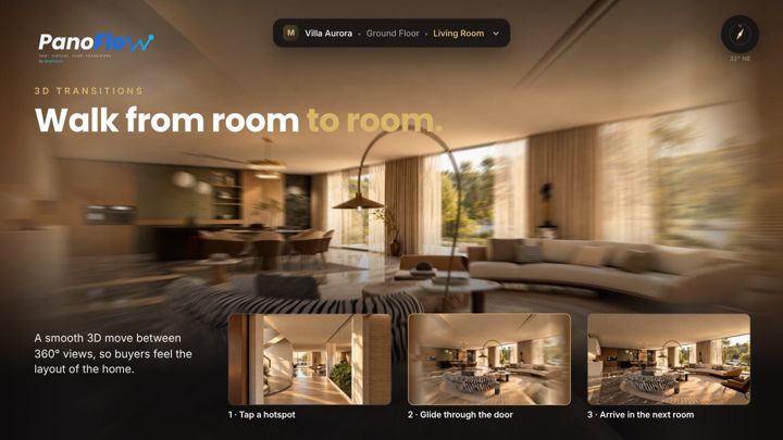
Room-to-room walk
Hotspots between rooms with smooth transitions, placed on your floor plan.
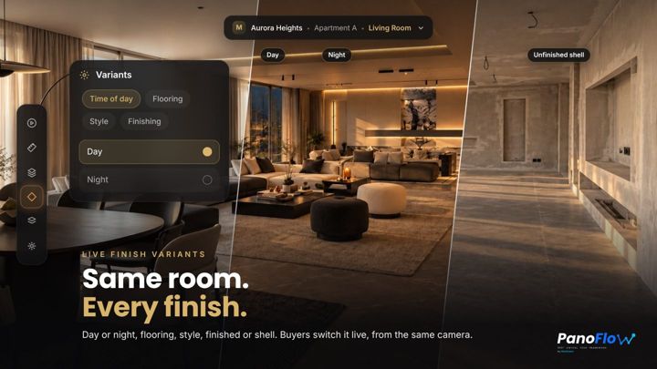
Live finish options
Furnishing, interior style, flooring, day / night. Switch in one tap.
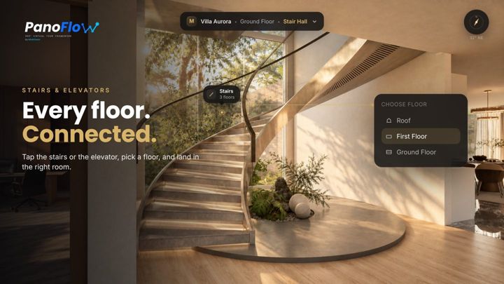
Floors & stairs
Multi-floor units with staircases or elevators and a live minimap.
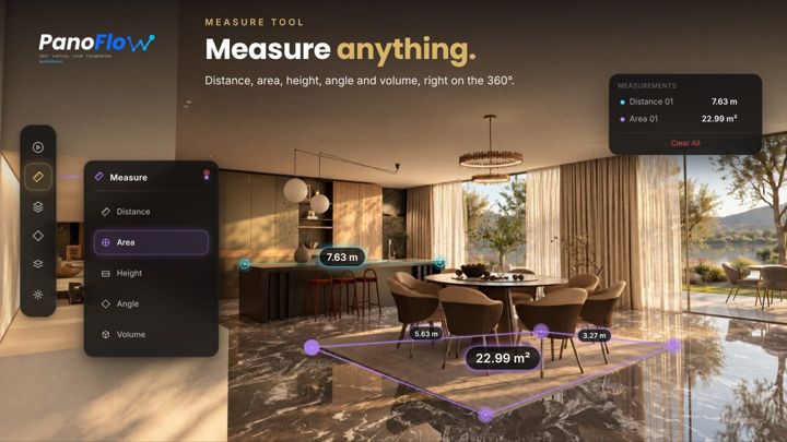
Room facts
Area, dimensions, ceiling height and a measure tool for distance and area.
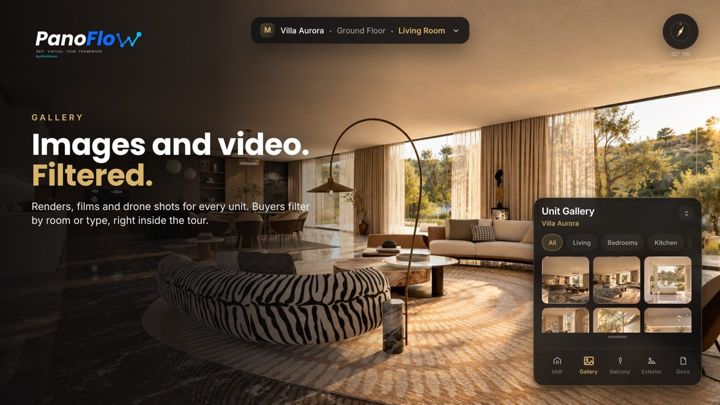
Sales material
Gallery, balcony and exterior views, payment plans and documents per unit.
The three actors and how they fit
A PanoFlow level is built from three actors. Each has one job, and none of them repeats another's settings.
MO_Project
The building or compound. It answers "what is this project and what's for sale?"
- Landing page: name, hero photo, tagline, location
- Developer card and stats strip
- List of units (one card each)
- UI Theme and branding
MO_Unit
One apartment, villa or office. It holds everything inside that unit.
- Floors, floor plans and rooms (360° renders)
- Links between rooms, doorways, stairs and landings
- Finish options (variants)
- Unit card, gallery, payment plans, documents
MO_Viewer
The camera and the player. It holds no content: it plays whichever unit the buyer opens.
- Zoom limits, mouse and touch speed
- Room-to-room transition feel
- Hotspot size, idle auto-rotate
- Minimap / transition calibration
What happens at Play: the landing page is built from MO_Project and its list of units. When the buyer taps Enter Virtual Tour on a card, MO_Viewer loads that MO_Unit and opens its start room. Tapping the project name in the header goes back to the landing page.
Quick rule: project-wide text and branding → MO_Project. Anything about rooms, floors or the unit's sales material → MO_Unit. How the tour feels to navigate → MO_Viewer.
Quick start
You need: equirectangular 360° renders (2:1, e.g. 4096×2048), one floor plan image per floor, and Unreal Engine 5.5 or newer.
Fastest way to learn: open the included demo map DEMO_ALL and press Play. Every setting below is filled in there.
Enable the plugin
Copy
MindOceaninto your project'sPluginsfolder (or install from Fab), then Edit → Plugins, search PanoFlow, enable, restart. 01_plugin.jpg
Search PanoFlow in Edit → Plugins, tick Enabled, then restart the editor. Set the Game Mode
Open World Settings and set GameMode Override to
MindOceanGameMode. It sets up the browser, input and HUD. 02_gamemode.jpg
World Settings → GameMode Override = MindOceanGameMode. Without it the landing page and the tour UI won't appear.Place the three actors
In Place Actors search MindOcean and drag into the level:
MO_Project(one per project),MO_Unit(one per unit, e.g. an apartment or a villa), andMO_Viewer(one per level). The default theme is assigned automatically.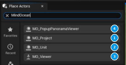 03_place_actors_n.jpg
MO_PopupPanoramaVieweris optional: it shows 360° gallery items in a popup.- MO_Project: the project (building / compound). One per level.
- MO_Unit: one apartment, villa or office. Add one per unit.
- MO_Viewer: the camera that plays the tour. One per level.
- MO_PopupPanoramaViewer: optional, opens 360° gallery shots in a popup.
Describe the project
Select
MO_Project. In Mind Ocean → Project fill Project Name, Project Logo and Company. UI Theme is already set.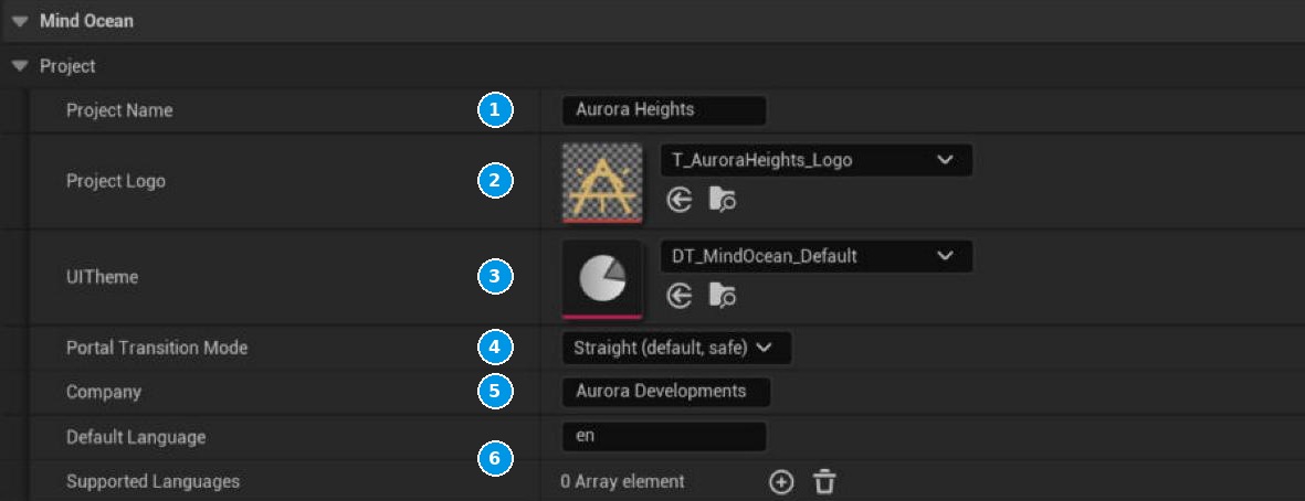 04_project_details_n.jpg
- Project Name: title on the landing page and in the tour header.
- Project Logo: shown next to the name in the tour header.
- UI Theme: colours, fonts, icons and branding (see Theme).
- Portal Transition Mode: how the camera moves between rooms. Keep Straight.
- Company: developer name in the stats strip.
- Default / Supported Languages: reserved for a future update.
Under Browser Display set the landing page: hero image, tagline, location, description, completion and the developer panel. Under Units add every
MO_Unitand keep Start With Browser on.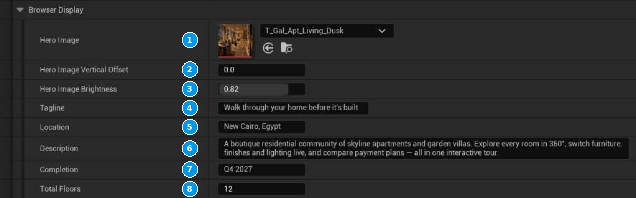 04c_browser_display_n.jpg
- Hero Image: the big background photo of the landing page.
- Hero Image Vertical Offset: moves the photo crop up or down.
- Hero Image Brightness: darkens the photo so text stays readable.
- Tagline: line under the project name.
- Location: city / area under the tagline.
- Description: longer project text.
- Completion: e.g. Q4 2027, shown in the stats strip.
- Total Floors: building floors, shown in the stats strip.
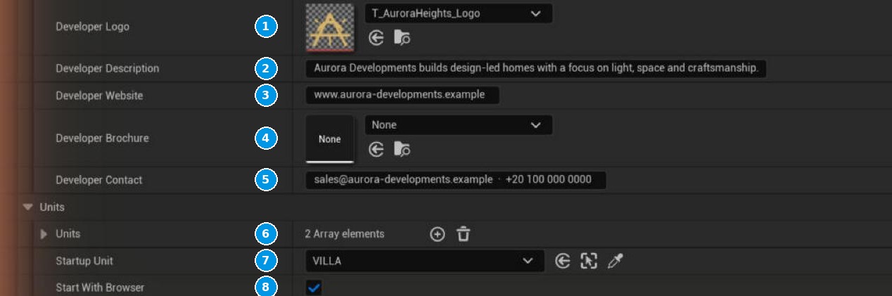 04b_project_browser_n.jpg
- Developer Logo: logo on the developer card.
- Developer Description: text on the developer card.
- Developer Website: link on the developer card.
- Developer Brochure: optional PDF / image for the brochure button.
- Developer Contact: email and phone on the card.
- Units: every
MO_Unitin the project, in card order. - Startup Unit: unit opened directly when the landing page is skipped.
- Start With Browser: on = open on the landing page; off = jump straight into Startup Unit.
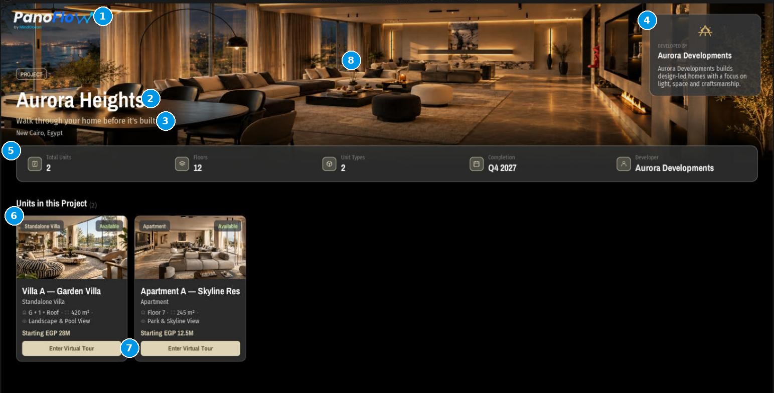 08_browser_n.jpg
What those fields produce: the project landing page. - Brand logo (from the UI Theme).
- Project Name (MO_Project).
- Tagline and Location (MO_Project).
- Developer card: Developer Logo / Description (MO_Project).
- Stats strip: units, Total Floors, unit types, Completion, Company.
- Unit card: built from each MO_Unit's Browser Card (cover, type, area, view, price, status).
- Enter Virtual Tour: opens that unit at its Default Start Node.
- Hero Image (MO_Project → Browser Display).
Add a floor and its plan
Select the
MO_Unit. All its settings sit in five groups: Data Info (unit card, floors, rooms), Connectors (stairs), Variants, Settings and Preview (what the viewport shows while you edit).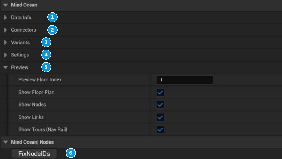 05_unit_overview_n.jpg
- Data Info: unit card, sales material, floors and rooms.
- Connectors: stairs and elevators between floors.
- Variants: finish options (furnishing, style, day/night).
- Settings: start room, north, calibration, camera height.
- Preview: what the editor viewport shows (plan, rooms, links).
- Fix Node IDs: repairs duplicate or empty room IDs after copying.
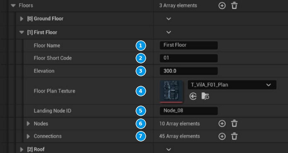
In Data Info → Floors add a floor: name, short code (GF / 01 / RF), elevation in cm, and Floor Plan Texture. The plan appears in the viewport. Scale the actor so the plan matches real size.
 07_floor_n.jpg
Landing Node ID is the room where the buyer arrives when they take the stairs to this floor. - Floor Name: shown in the floor selector.
- Floor Short Code: short label, e.g. GF / 01 / RF.
- Elevation: floor height in cm (0, 300, 600…).
- Floor Plan Texture: plan image for the editor and the minimap.
- Landing Node ID: room where buyers arrive by stairs / elevator (see Landing node).
- Nodes: the rooms of this floor.
- Connections: which rooms are walkable to each other.
Add rooms (nodes)
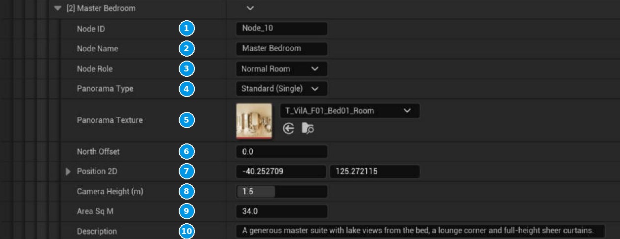
In the floor's Nodes add one entry per 360° render. Give it a Node Name and Panorama Texture, then place it on the plan with Position 2D. Area, room type and the rest fill the room card (see below).
 08_node_n.jpg
- Node ID: unique room ID. Links and landings point to it.
- Node Name: room name on hotspots, header and card.
- Node Role: Normal Room, or Landing for the stairs room.
- Panorama Type: Standard (one render) or Multi-Variant.
- Panorama Texture: the 360° render.
- North Offset: turns this one panorama (or use the calibration tool).
- Position 2D: room position on the plan.
- Camera Height (m): render camera height, for the measure tool.
- Area Sq M: shown on hotspot and card.
- Description: text on the room card.
 plan_nodes.jpg
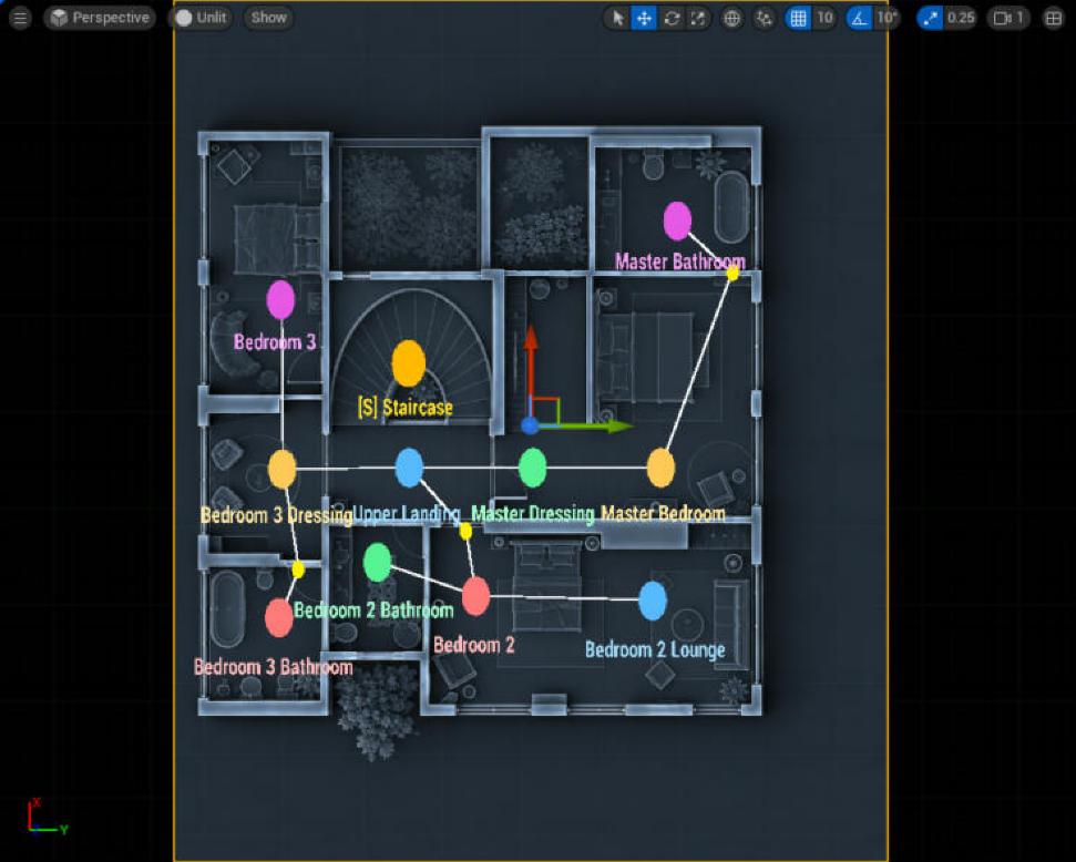
Each coloured dot is a room. White lines are walkable links; yellow dots are doorways. Link the rooms
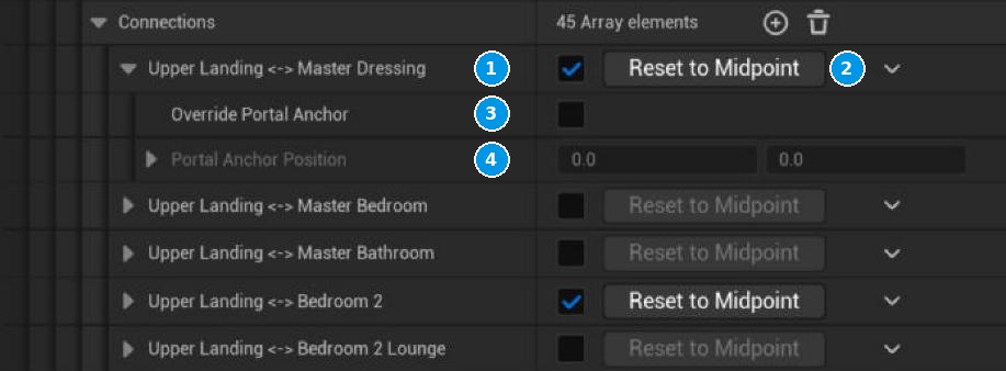
In the floor's Connections, tick Connected for every pair of rooms you can walk between. A line appears on the plan, and a hotspot appears in the tour.
 07_connections_n.jpg
Every pair of rooms is listed once. Tick the ones you can walk between. - Connected: tick to make the two rooms walkable (both ways).
- Reset to Midpoint: puts the doorway back halfway between the rooms.
- Override Portal Anchor: tick to place the doorway yourself.
- Portal Anchor Position: the doorway point on the plan, so the hotspot sits on the real door.
Press Play
The browser opens with your unit card. Enter Virtual Tour starts at Default Start Node ID.
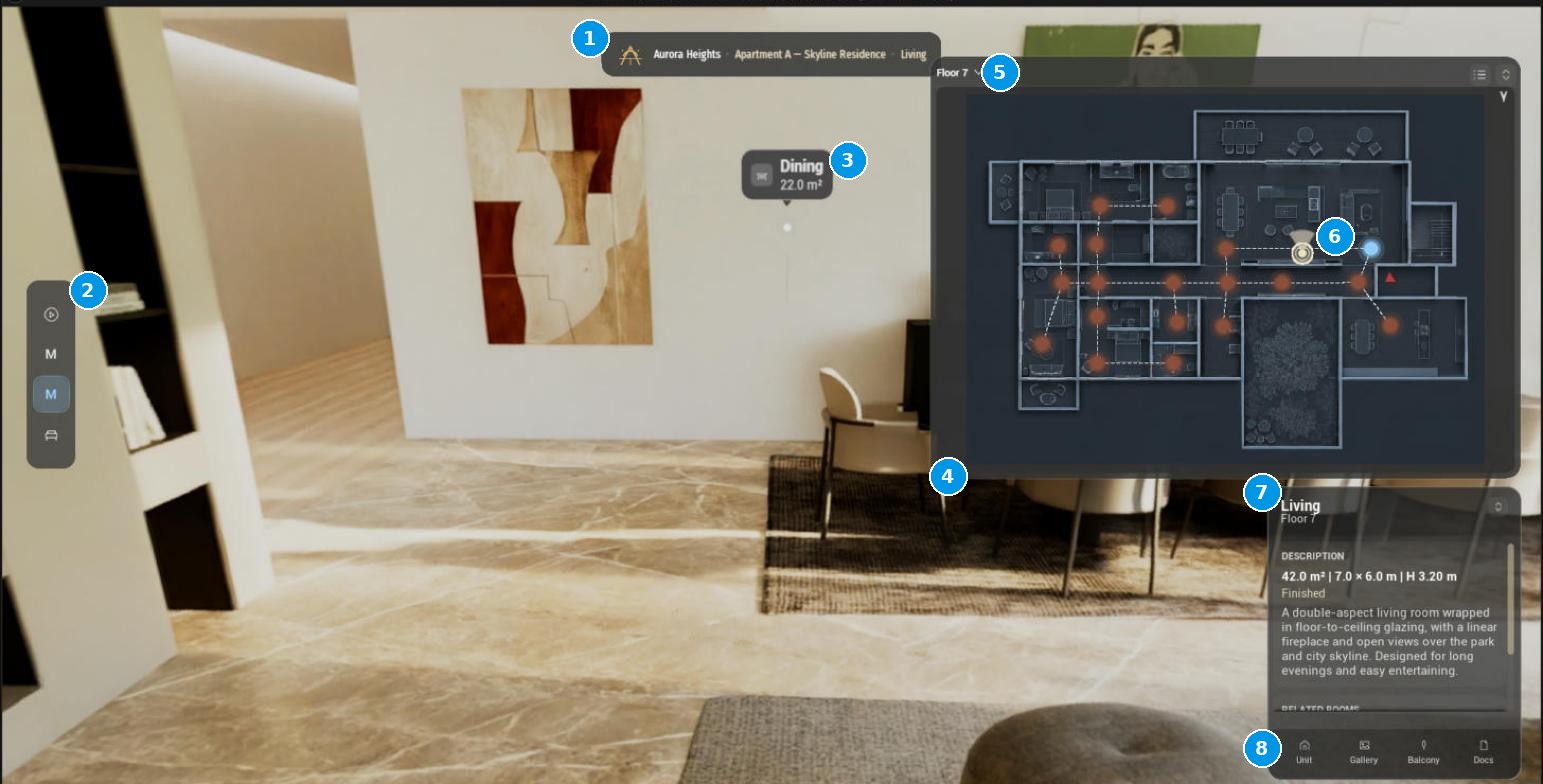 09_tour_n.jpg
Inside the tour: the tools rail on the left, the header with project and room, a hotspot to the next room, the minimap and the room card. - Header: project › unit › room. Tap the project name to go back to the landing page.
- Tools rail: Tours, Measure, Minimap, Variants.
- Hotspot: next room with its area. Tap to walk there.
- Minimap: the floor plan with every room. Tap a room to jump.
- Floor selector: switch floors.
- You are here, with the view cone showing where you look.
- Room card: area, size, finish, description, related rooms.
- Unit buttons: Unit, Gallery, Balcony, Docs.
Floor plan & rooms in detail
Doorways (Portal Anchor)
By default a hotspot points at the midpoint between two rooms. When the doorway is elsewhere, open the connection, tick Override Portal Anchor and set Portal Anchor Position, or press Reset to Midpoint. The yellow dot on the plan shows it.
Room card
Each node's Info and Card Display fields fill the card the buyer sees: area, room type (or a custom label), ceiling height, orientation and width × depth. Turn a Show … box off to hide that line. Set a Gallery Image to show a real photo instead of a crop of the 360°.
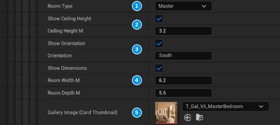
- Room Type: picks the hotspot icon.
- Show Ceiling Height / Ceiling Height M: card line.
- Show Orientation / Orientation: card line, e.g. South.
- Show Dimensions / Room Width / Depth: card line, width × depth in metres.
- Gallery Image: real photo for the card instead of a crop of the 360°.
Floors & stairs
Add a floor per level and set its Elevation and Floor Short Code (e.g. GF / 01 / RF). Under Connectors add a staircase or elevator, place it, and tick each floor in Floors Served. Set each floor's Landing Node ID: the room where the buyer arrives.
The Landing node: what, why, how
What: a normal room (node) at the top or bottom of the stairs or at the elevator door, marked as the arrival room of its floor.
Why it's needed: a staircase serves several floors, so PanoFlow must know which room to open when the buyer picks another floor. Without a landing, the stairs hotspot has nowhere to go on that floor.
How: 1) On each floor, add a node at the stairs (e.g. Stair Hall) with its panorama and set Node Role = Landing. 2) Connect it to the nearby rooms like any room. 3) In that floor, set Landing Node ID to its Node ID. 4) Make sure the connector's Floors Served ticks that floor.
One landing per floor served by stairs or elevator. Single-floor units don't need one.
Calibrating panoramas (fixing rotated 360° images)
If a render was exported facing a different direction, its room opens turned the wrong way, hotspots don't sit on their doors and the minimap cone doesn't match. You fix it visually, no numbers needed:
- Select the
MO_Unit, tick Settings → Show North Calibration Tool, then press Play. - A bar appears at the bottom of the screen with a TRUE NORTH ↑ marker. Pick a mode:
- Calibrate North (All Images): when every render shares the same wrong rotation (common when the whole batch came from one camera setup). Saves to the unit's Global Panorama Yaw Offset.
- This Image: when only the current room is off. Saves to that node's North Offset.
- Drag left/right: the panorama turns under the camera (up/down still looks normally). Turn it until the plan's north direction in the room lines up with the TRUE NORTH marker. The live value shows on the bar.
- Click Confirm to write the value to the level (or Cancel to drop it). Stop Play and save the level.
Final rotation of each image = Global Panorama Yaw Offset + its own North Offset, so fix the shared error first with All Images, then fine-tune single rooms with This Image. You can also type the values directly in the same fields. The tool is editor-only and never appears in packaged builds.
Different from North Angle (turns the compass / minimap north) and from MO_Viewer's Minimap Yaw Calibration (aligns the minimap view cone; 90 is correct for most projects).
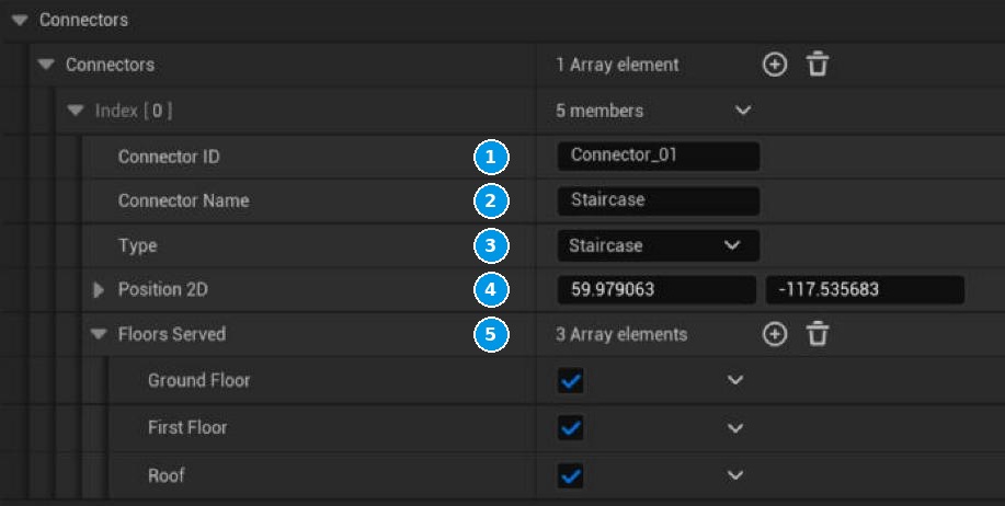
- Connector ID: unique ID.
- Connector Name: hotspot label, e.g. Staircase.
- Type: Staircase or Elevator (elevator opens a floor picker).
- Position 2D: where it sits on the plan, same spot on every floor.
- Floors Served: tick every floor it reaches.
Finish options (Variants)
- Turn on Enable Variant Authoring.
- In Variant Groups add a group (e.g. Furnishing) with an ID, display name and icon, then its options (Furnished, Unfurnished). Mark one option per group as Base.
- On a node, set Panorama Type to Multi-Variant and assign a render to each combination in the variant panel.
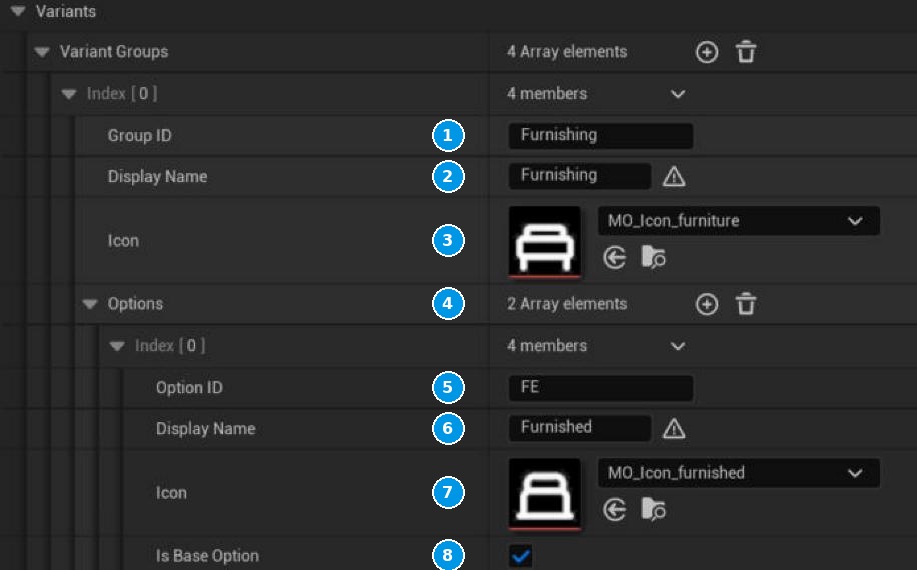
- Group ID: internal ID, don't rename after use.
- Display Name: tab name in the tour.
- Icon: tab icon.
- Options: the choices in this group.
- Option ID: internal ID.
- Display Name: option label.
- Icon: option icon.
- Is Base Option: the default look, uses the node's normal render. One per group. Below the groups, tick Enable Variant Authoring to show the variant panel on nodes.
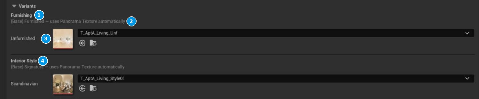
- Group name (Furnishing).
- The Base option uses the node's Panorama Texture automatically.
- A slot per other option: pick its render.
- Next group (Interior Style) with its own slots.
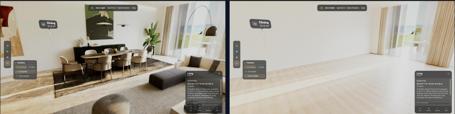
Reference: every setting
Tip: click any screenshot to open it full size.
Every setting lives in the Details panel under Mind Ocean. Hover any field in the editor for the same explanation. Fields marked optional can stay empty; the tour hides what has no data.
MO_Project: the project (one per level)
Project
| Field | What it does · why you set it |
|---|---|
| Project Name | Shown in the tour header and on the landing page. Required. |
| Project Logo | The project's own logo in the tour header (top centre). Optional. |
| UI Theme | Colours, fonts, icons, branding. Filled with the plugin default automatically; swap it to restyle everything. |
| Portal Transition Mode | How the camera moves between rooms. Straight is the safe default; the curved mode bends the move through the doorway. |
| Company | Developer name shown in the stats strip. |
| Default Language · Supported Languages | Reserved for a future localisation update. Leave as is. |
Browser Display (the landing page)
| Field | What it does · why you set it |
|---|---|
| Hero Image | Big background photo of the landing page. Use your best render. |
| Hero Image Vertical Offset | Moves the crop up or down when the important part of the photo is cut off. |
| Hero Image Brightness | Darkens the photo so white text stays readable (0.82 default). |
| Tagline · Location · Description | Text under the project name. |
| Completion | Free text such as Q4 2027, shown in the stats strip. |
| Total Floors | Building floor count for the stats strip (not the unit's own floors). |
| Developer Logo / Description / Website / Contact / Brochure | The developer card on the right of the landing page. Optional. |
Units
| Field | What it does · why you set it |
|---|---|
| Units | Every MO_Unit in the project, in the order the cards appear. A unit not listed here has no card. |
| Startup Unit | The unit opened when the landing page is skipped. |
| Start With Browser | On: open on the landing page. Off: go straight into Startup Unit (useful for a single-unit kiosk). |
MO_Unit: a unit (one per apartment, villa, office…)
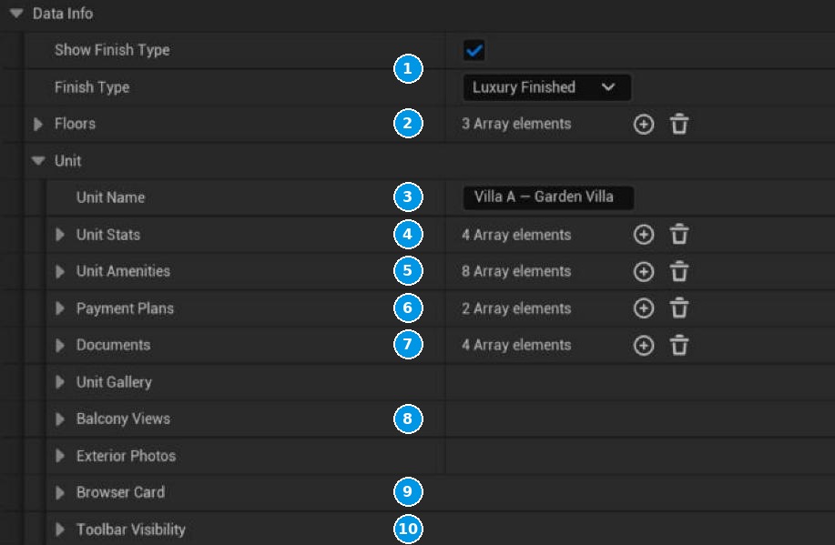
- Show Finish Type / Finish Type: badge on the room card.
- Floors: the unit's floors (next step).
- Unit Name: header and card title.
- Unit Stats: number + label grid in the Unit panel.
- Unit Amenities: feature pills.
- Payment Plans: plan name, down payment, instalments, years.
- Documents: brochure, price list, plans.
- Unit Gallery / Balcony Views / Exterior Photos: media behind the tour buttons.
- Browser Card: the unit's card on the landing page (below).
- Toolbar Visibility: hide any of the Unit / Gallery / Balcony / Exterior / Docs buttons.
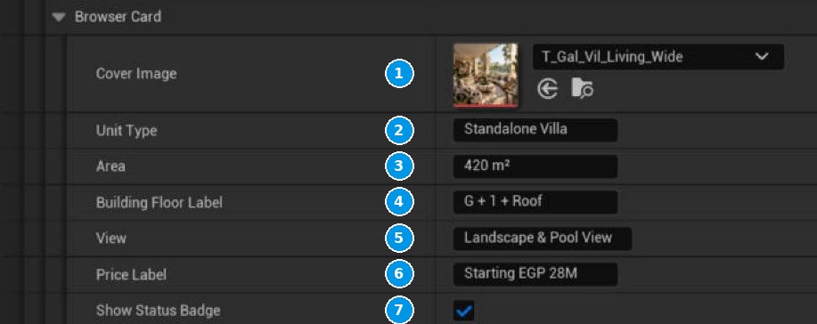
- Cover Image: card photo.
- Unit Type: e.g. Standalone Villa.
- Area: shown on the card.
- Building Floor Label: e.g. G + 1 + Roof or Floor 7.
- View: e.g. Landscape & Pool View.
- Price Label: e.g. Starting EGP 28M.
- Show Status Badge / Status: Available, Reserved or Sold on the card.
Data Info · badges
| Field | What it does · why you set it |
|---|---|
| Show Finish Type · Finish Type | Badge such as Luxury Finished or Core & Shell on the room card. |
Data Info · Unit (the unit panel and card)
| Field | What it does · why you set it |
|---|---|
| Unit Name | Name in the header and on the card. |
| Unit Stats | Grid of number + label (e.g. 4 · Bedrooms) in the Unit panel. |
| Unit Amenities | Pills such as Private pool. |
| Payment Plans | Plan name, down payment, number of instalments, years. Leave empty for cash-only. |
| Documents | Brochure, price list, floor plans: display name, a size label (e.g. PDF · 2 MB) and the file. |
| Unit Gallery · Balcony Views · Exterior Photos | Three media sections behind the Gallery, Balcony and Exterior buttons. Each has categories of images, videos or 360° shots; turn Is 360 on for panoramas. |
| Browser Card | Cover image, unit type, area, building floor label, view, price label, status badge (Available / Reserved / Sold). Empty fields are hidden. |
| Toolbar Visibility | Hide the Unit, Gallery, Balcony, Exterior or Docs button without deleting its content. |
Data Info · Floors
| Field | What it does · why you set it |
|---|---|
| Floor Name · Floor Short Code | Shown in the floor selector, e.g. First Floor · 01. |
| Elevation | Height of the floor in cm (e.g. 0, 300, 600). Keeps floors apart in 3D and orders them. |
| Floor Plan Texture | The plan image: shown in the editor to place rooms, and in the tour minimap. |
| Landing Node ID | Where the buyer arrives on this floor when they take the stairs or elevator. Set it to the room next to the staircase (usually a landing or hall). Without it, changing floors has no arrival room. |
| Nodes | The rooms on this floor (see Node below). |
| Connections | Every pair of rooms on the floor. Tick Connected to make a walkable link and a hotspot. Expand one to place its doorway. |
Connectors (stairs & elevators)
| Field | What it does · why you set it |
|---|---|
| Connector ID · Name | Unique ID and the label on its hotspot (e.g. Staircase). |
| Type | Staircase or Elevator. The elevator opens a floor picker. |
| Position 2D | Where it sits on the plan; the same spot on every floor. |
| Floors Served | Tick each floor it stops at. On each served floor the buyer arrives at that floor's Landing Node ID. |
Variants
| Field | What it does · why you set it |
|---|---|
| Variant Groups | Finish categories (Furnishing, Interior Style, Floor Finish, Time of Day). Each has a Group ID (internal, don't rename later), a display name and an icon. |
| Options | The choices in a group: Option ID, display name, icon, and Is Base Option (the default look, which uses the node's normal Panorama Texture). Mark exactly one per group. |
| Enable Variant Authoring | Shows the per-node variant panel in the editor. Leave off for projects without variants. |
Settings
| Field | What it does · why you set it |
|---|---|
| Default Start Node ID · Default Start Floor Index | The room the tour opens in. Pick the entrance or the best room. |
| North Angle | Rotates the compass so N matches the real north of the plan. |
| Global Panorama Yaw Offset | Turns every panorama at once when your renders were exported with a different forward direction. |
| Show North Calibration Tool | Editor-only button to align north while playing. Never shipped in packaged builds. |
| Default Node Height | Camera height in cm used to place rooms and hotspots in 3D (170 default). |
Preview (editor only)
| Field | What it does |
|---|---|
| Preview Floor Index | Which floor's plan and rooms the viewport shows. |
| Show Floor Plan · Show Nodes · Show Links | Toggle the plan, room dots and link lines in the viewport. |
| Show Tours (Nav Rail) | Shows or hides the Tours button in the tour's tools rail. |
| Fix Node IDs (button) | Renumbers duplicate or empty node IDs. Use it after copying rooms. |
Node: a room
- Node ID: unique room ID. Links and landings point to it.
- Node Name: room name on hotspots, header and card.
- Node Role: Normal Room, or Landing for the stairs room.
- Panorama Type: Standard (one render) or Multi-Variant.
- Panorama Texture: the 360° render.
- North Offset: turns this one panorama (or use the calibration tool).
- Position 2D: room position on the plan.
- Camera Height (m): render camera height, for the measure tool.
- Area Sq M: shown on hotspot and card.
- Description: text on the room card.
| Field | What it does · why you set it |
|---|---|
| Node ID | Unique ID (Node_01…). Links, landings and the start room point to it. Don't reuse one. |
| Node Name | Room name on hotspots, the card and the header. |
| Node Role | Normal Room for ordinary rooms. Landing for the room at the top or bottom of the stairs: it is where buyers arrive after changing floors, so the floor's Landing Node ID should point to it. |
| Panorama Type | Standard: one render. Multi-Variant: one render per finish option (variant panel appears below). |
| Panorama Texture | The 360° render (2:1). For Multi-Variant it is the Base look. |
| North Offset | Turns this one panorama so its north matches the plan. Easiest set with the calibration tool (see Calibrating panoramas). |
| Position 2D | The room's spot on the plan. Hotspots and the minimap use it. |
| Camera Height (m) | Camera height at render time (1.5 m default). Makes the measure tool accurate. |
| Area Sq M · Description · Room Type / Custom Type Text | Room card text and the icon on the hotspot. |
| Show Ceiling Height · Show Orientation · Show Dimensions | Turn each card line on and fill its value (height in m, e.g. South-West, width × depth in m). |
| Gallery Image | A real photo for the card instead of a crop of the 360°. |
| Variants panel | Multi-Variant only: one render slot per non-base option. |
Connection (doorway)
| Field | What it does · why you set it |
|---|---|
| Connected | Makes the two rooms walkable both ways. |
| Override Portal Anchor · Portal Anchor Position | Puts the doorway where it really is, so the hotspot and the transition go through the door, not the wall. |
| Reset to Midpoint | Puts the doorway back halfway between the rooms. |
MO_Viewer: camera & feel (one per level)
| Field | What it does · why you set it |
|---|---|
| Data Manager | The unit shown when the level starts. Set automatically when entering from the landing page. |
| FOV · Min FOV · Max FOV | Starting view width and how far buyers can zoom in and out. |
| Mouse Sensitivity · Touch Look / Zoom Sensitivity | Mouse and touch tuned separately. |
| Transition Duration | Seconds for the move between rooms (0.5 default). |
| Motion Blur · Blur Start / End · Ghost Trail | The feel of the move. Lower them for a calmer transition. |
| Hotspot Height · Hotspot FOV Compensation | Height of the room labels and whether they keep their size while zooming. |
| Idle Delay / Fade In / Spin Speed | Slow auto-rotate after no input, for showroom screens. |
| Minimap Yaw Calibration Deg · Mirror Minimap Yaw | Aligns the view cone on the minimap with where the camera looks. Change it only if the cone points the wrong way (try 90, -90, 180). |
| Transition Yaw Offset · Mirror Transition Y | Aligns the direction of the room-to-room move if your plan is rotated. |
| Sphere Radius · Dist Factor · Min / Max Offset | Internal sizes of the panorama spheres. Leave as is. |
| Enhanced Input | Your own input actions. Leave empty to use the plugin's. |
In the tour: what the buyer sees and does
- Header: project › unit › room. Tap the project name to go back to the landing page.
- Tools rail: Tours, Measure, Minimap, Variants.
- Hotspot: next room with its area. Tap to walk there.
- Minimap: the floor plan with every room. Tap a room to jump.
- Floor selector: switch floors.
- You are here, with the view cone showing where you look.
- Room card: area, size, finish, description, related rooms.
- Unit buttons: Unit, Gallery, Balcony, Docs.
| Element | What it does |
|---|---|
| Look & zoom | Drag to look around, mouse wheel or pinch to zoom. After a pause the view slowly auto-rotates. |
| Hotspots | Labels in the room (name, area). Click or tap to walk to that room. |
| Header (top) | Project › unit › room. Click it to go back to the landing page. |
| Tools rail (left) | Tours, Measure (distance / area), Minimap and Variants. |
| Variants panel | Tabs per group (Furnishing, Style…). Swipe the tabs on touch screens; pick an option to switch the render instantly. |
| Minimap (top right) | Plan with every room and a view cone. Click a room to jump there; switch floors from its menu; expand it for a bigger plan. |
| Room card (bottom right) | Area, dimensions, finish, description and related rooms. Buttons: Unit, Gallery, Balcony, Exterior, Docs. |
| Compass | Shows north. Uses the unit's North Angle. |
Theme & branding
All visuals come from one theme asset. Duplicate DT_MindOcean_Default, edit the copy, and assign it to UI Theme on the project. Each client can get their own look from the same plugin.
| Section | What you change |
|---|---|
| Branding | Brand Logo (top-left of the browser), its height and offset, or a brand name and subtitle when there is no logo. |
| Colors | Background, glass panels, borders, accent and selected colours, opacities. |
| Typography | Fonts and sizes for titles, labels and body text. |
| Icons | Rail icons, room-type icons, info-card icons. |
| Navigation rail | Width, margin, left or right side. |
| Node Preview | Editor-only look of the plan: Icon Scale, Label Size, colours, link colour and thickness. |
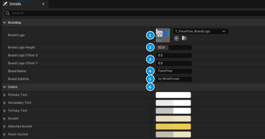
- Brand Logo: your logo on the landing page.
- Brand Logo Height: its size in pixels.
- Brand Logo Offset X / Y: nudges it.
- Brand Name: text used if there is no logo.
- Brand Subtitle: small line under the name.
- Colors: text, accent, selected and hover colours for the whole UI.
Panorama quality
By default Unreal adds tone mapping, bloom and dynamic resolution, which make a finished render look softer and shifted in colour. PanoFlow switches these off for the tour so the buyer sees your render exactly as it left your renderer. You find the settings on MO_Viewer under Mind Ocean → Panorama Quality.
| Field | What it does · why you set it |
|---|---|
| Exact Panorama Colors | On by default. Passes your render's colours through untouched: no tone curve, no bloom, vignette or grain, fixed exposure. |
| Exact Colors Exposure Bias | Brightens or darkens every panorama a little. Leave at 0 unless all your renders look too dark or too bright on the client's screen. |
| Sharp Panorama Rendering | On by default. Renders at full resolution with light anti-aliasing so fine detail like marble veins and fabric stays crisp. |
Texture import settings
For each 360° render texture use Compression: BC7, Mip Gen Settings: NoMipmaps and Never Stream: on. The demo panoramas are already set this way.
If a panorama looks blurry in Play, check its texture settings first. A texture that streams or uses default compression is the usual cause.
Packaging for Windows & Android
Windows
Platforms → Windows → Package Project. Shipping is recommended for clients. Make sure your tour map is the Game Default Map in Project Settings → Maps & Modes.
Android
- Install Android Studio and set the SDK / NDK paths in Project Settings → Platforms → Android SDK.
- Set a package name and accept the SDK license in Platforms → Android.
- Package with Android (ASTC). Keep panoramas at 4096×2048 or smaller.
- Install with the generated
Install_*.batwhile the device is connected with USB debugging on.
Touch works out of the box: drag to look, pinch to zoom, tap hotspots and cards, swipe the variant tabs.
FAQ
Do I need to write code or Blueprints?
No. Everything is set in the Details panel. Full C++ source is included if you want to extend it.
What size should my renders be?
Equirectangular 2:1. 4096×2048 works on all platforms; 8192×4096 looks sharper on Windows but is too heavy for most Android devices.
Can I have several units in one project?
Yes. Add one MO_Unit per unit and list them in the project's Units. The demo has an apartment and a three-floor villa.
The plan labels are too big or small.
Change Node Preview → Icon Scale / Label Size in the theme. This only affects the editor.
Hotspots point at the wall instead of the door.
Use Override Portal Anchor on that connection.
Support
Questions, bugs or feature requests: email us and include your engine version and a screenshot.
support.mindocean@gmail.com